ManualSettings in the app
Settings in the app
Eleven sections under “More”, in the same order and under the same names as in the dashboard.
Where they are
All the settings hang off the “More” tab, in the topmost section. There are eleven of them, and they carry the dashboard's names in the dashboard's order. Somebody who learned one surface should not have to work out that “Brand and storefront” is called something else here.
Where the split differs, the app follows the web: the lead times are under “Hours”, the minimum order under “Delivery”, and “Ordering” contains only the ordering channels. The rows say so too, rather than pretending the setting does not exist.
Every screen writes only its own block. That is why two people can work on different sections at the same time without overwriting each other.
The section is visible only to accounts with the “Settings” area. For everybody else these would be tiles that get refused when tapped.
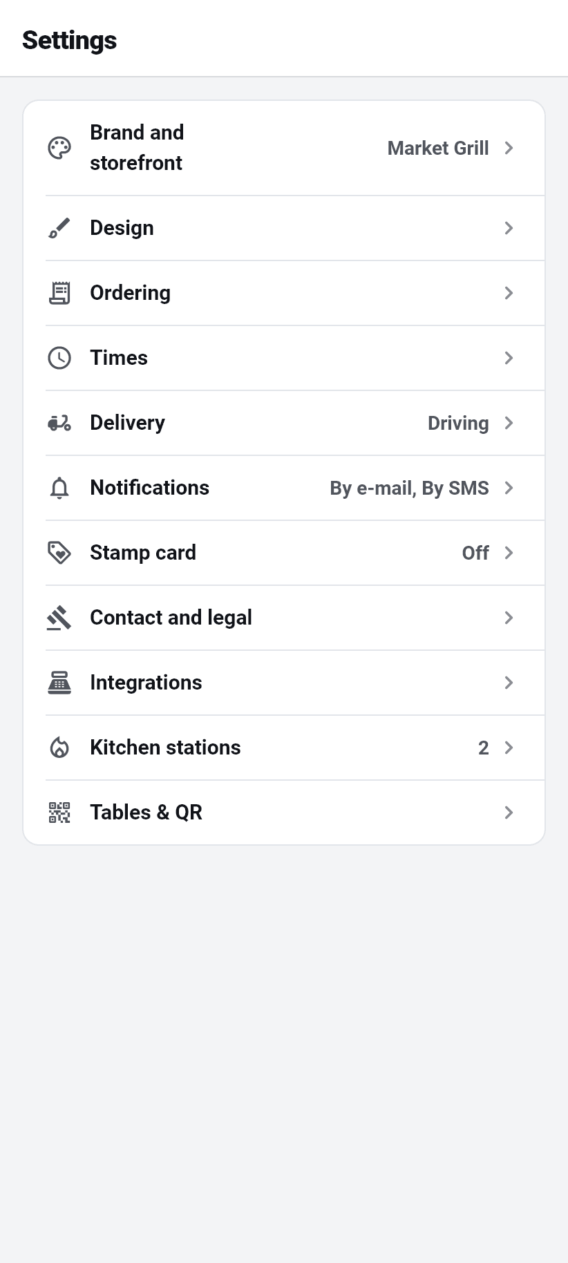
Brand and storefront
Name of the restaurant, web address, logo, brand colour, cuisines, price level and the marketplace switch.
The web address is the front part of your ordering page. As you type, the app says at once whether it is free, taken or reserved, and allows only lowercase letters, digits and hyphens. ⚠️ It also warns: after a change, printed QR codes lead nowhere and have to be reprinted.
The logo comes from the camera, from the photo library or from an address on the net, and it is cropped right there on the phone: drag to move, two fingers to zoom, whatever falls outside the frame is cut off. Up to 1 MB, as PNG, JPG, WebP or SVG. The camera is first because the owner is usually standing in the restaurant with the sign on the wall behind them.
The cuisines are at most ten keywords, comma-separated: that is how guests find you in the marketplace. Whether you appear there at all is decided by the “Show in the marketplace” switch. Off means: only somebody with your link or your QR code finds you.
Design
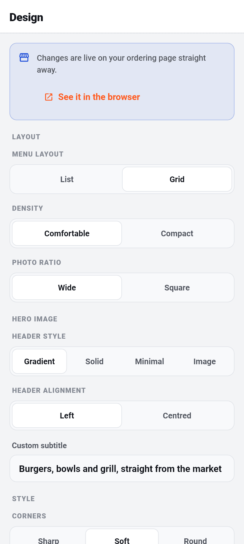
How your ordering page looks in the browser. Everything the design panel in the dashboard has is here too: menu layout (list or tiles), density, picture format, header (gradient, solid, minimal or image), header alignment, your own subtitle, corners, buttons, colour scheme, whether product pictures are shown, whether the info block sits in the footer, whether guests may switch language and whether the table number is displayed.
Along with the language of your ordering page: either a fixed default language or “follow the guest's device”. What is meant is what somebody who has never chosen sees.
And the reviews: whether the Google rating sits at the top of the header, how many review cards appear under the menu (zero hides them) and the link to your Google review page, so that guests can read all of them there and not only the imported ones.
It saves at once, with no save button. Every one of these settings is a choice between two or three words with a visible effect and no meaningful in-between state, and that is exactly where a save button only adds a way to lose the change.
Cover image up to 4 MB. The Google listing itself is imported in the browser, through the wizard's restaurant search.

Ordering
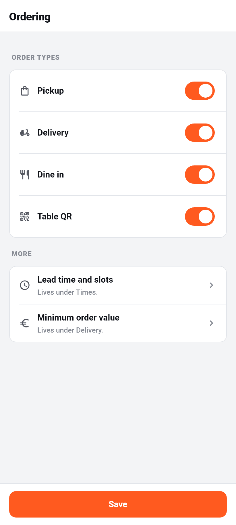
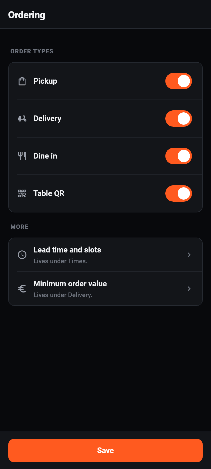
Four switches and nothing else: pickup, delivery, dine-in, table QR. They decide which ways a guest may order at all.
⚠️ An ordering channel your plan does not include is shown disabled, with the reason beside it, and is not hidden. A missing switch looks like a missing feature; a disabled one saying “not included in your plan” is an answer.
Below them two rows that lead elsewhere: “Lead time and slots” is under Hours, “Minimum order value” under Delivery. They are here because this is where they are looked for, and they say where they really are rather than being a copy that drifts.
Online payment is deliberately no longer a switch on this screen. It hangs solely on whether a payment provider is connected and “offer to guests” is on, see Integrations. There used to be both, and an owner with a connected account still got no online payment because the second switch was off somewhere.
Hours
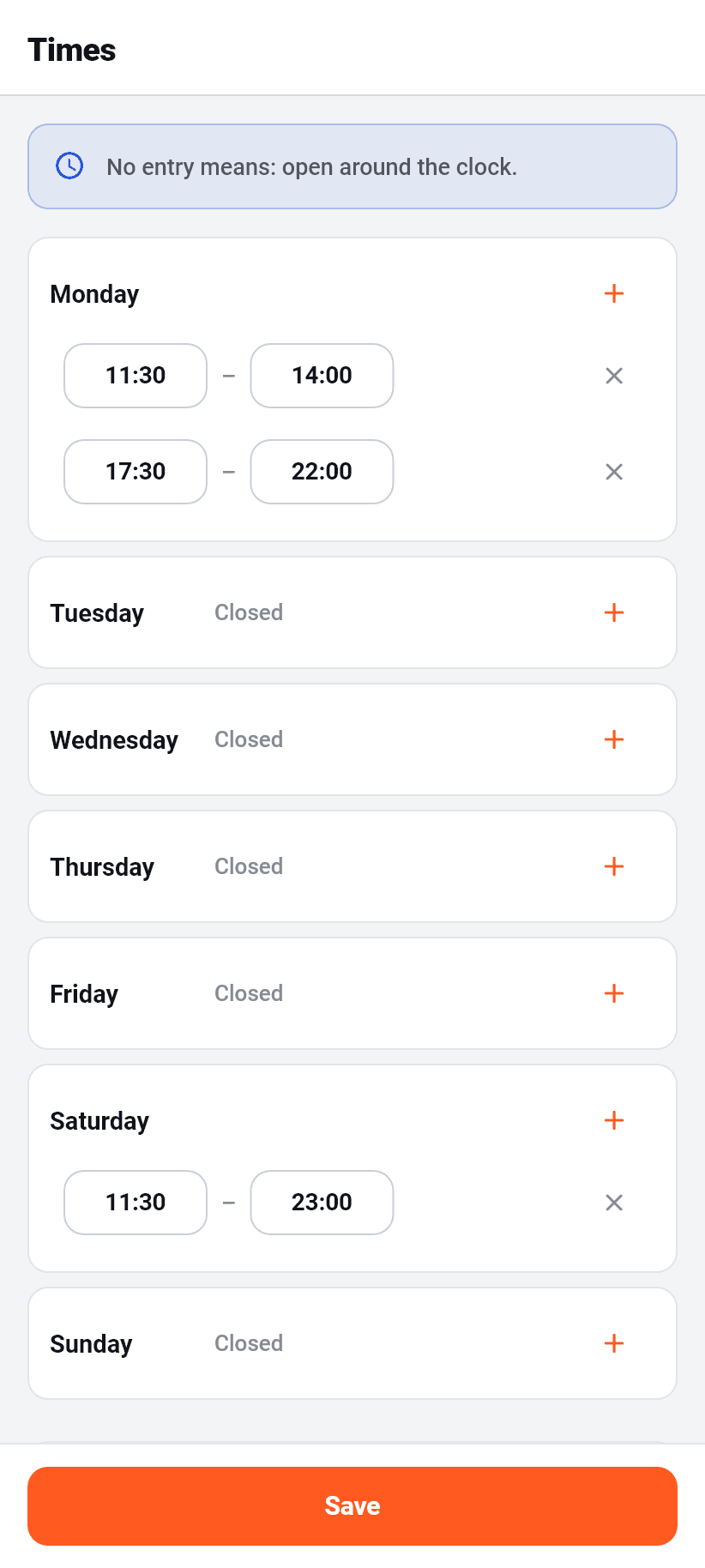
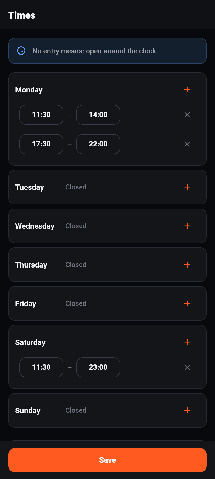
Opening hours per weekday, each day with any number of time windows. A lunch break is simply two windows on one day. A day with no window is closed.
⚠️ With not a SINGLE entry, the rule is: open around the clock. That is written at the top of the screen too, because it is the default most likely to surprise.
The delivery times are a separate list in the same shape. With no entry the opening hours apply there, and anybody who stops driving in the evening although the place is still open enters exactly that here.
Along with the timing of orders: lead time for pickup and for delivery separately, the length of a slot for pre-orders, whether pre-orders are allowed at all, and how many days ahead they may be placed.
Delivery
The delivery area comes in three shapes, and exactly one applies at a time: radii around the restaurant, zones following the actual driving distance, or areas drawn by hand. Drawing two at once produced an orange mush on screen in which no zone could be told from another.
The location comes from your address and is determined quietly, with no coordinates on screen and no locate button. Every distance is measured from that point; without it no delivery address can be checked.
The map is real and can be operated. With radii you drag the handle on the edge of a ring to make it bigger or smaller. When drawing you tap the corners of your area onto the map and close the shape with a tap on the first point. With driving distance a button works the zones out; until then the straight line times a detour factor applies, and the app says so.
Localities always belong wholly to one zone, so that no zone boundary runs through the middle of a village. Per locality you can fix the zone, let the position decide, or exclude it entirely.
⚠️ Fee and minimum order belong to a ZONE. The general minimum order, which also lives here under “Delivery”, is only the floor: if an address falls into a zone with a higher one, the higher one wins.
As the crow flies
Rings around the restaurant
Driving distance
as far as you really drive on the road
Drawn by hand
corner by corner on the map
Notifications to guests
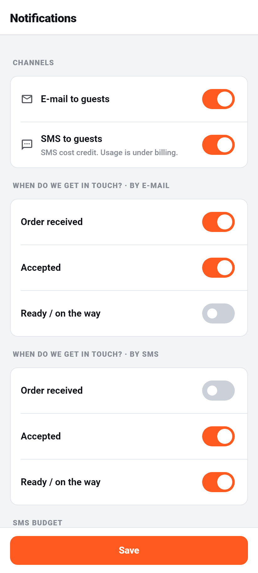
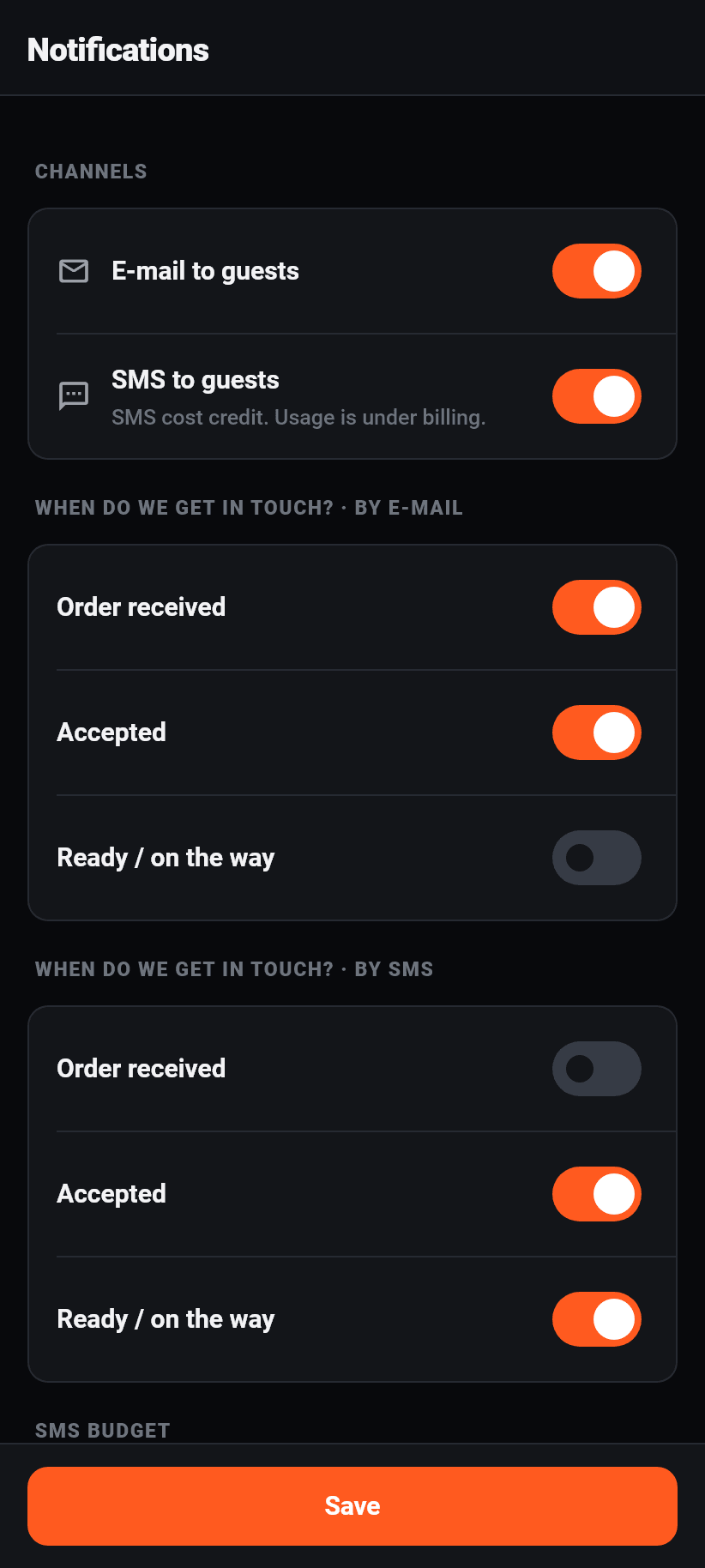
This is what the GUEST gets, not what arrives on your phone. Two channels: e-mail, in every plan and at no extra cost, and SMS from Pro upwards against credit.
Three events per channel: order received, accepted, ready or on its way. They can be set individually, separately for e-mail and SMS.
Along with the sender name an SMS appears under. Eleven characters at most, letters and digits only, that is all the SMS network allows. Enter nothing and we use the name of your restaurant. A guest cannot reply to an SMS that carries a name instead of a number.
Below that your SMS budget: how much your plan includes, how much of it is used and how much bought credit is left. Buying more and switching on automatic top-up happen in the browser; if the credit is empty and the automatic top-up is off, no more SMS go out.
Stamp card
From the Pro plan upwards. You set after how many completed orders there is a reward and which: a percentage off the goods value, a fixed amount, or a particular dish for free.
Along with a minimum order value the reward applies from. With a free dish you should enter something there, otherwise the redeemed order consists of nothing but the reward.
Cancelled orders do not count. Switch the card off and collected stamps stay, only no new ones are added and nothing is redeemed.
The minimum order and order types for a stamp, the expiry, the figures and the guest list are in the browser: Settings → Stamp card and “Regulars” in the sidebar. The app leaves them as they are when you save here.
⚠️ Stamps are given only on orders placed through the app with a customer account. Nobody can sign in on your ordering page in the browser, so nobody collects there. The app says so at this spot too, so that “why is nobody collecting” never arises.
Contact and legal
The restaurant's address, phone number, e-mail and website, along with the coordinates needed for distance and delivery zone.
The legal notice is a mandatory declaration and is linked from your ordering page. The restaurant is responsible for it, not Flavoso.
The text building blocks for your privacy policy are in the browser: they are long paragraphs to copy, and a phone is the worse place for that.
Integrations
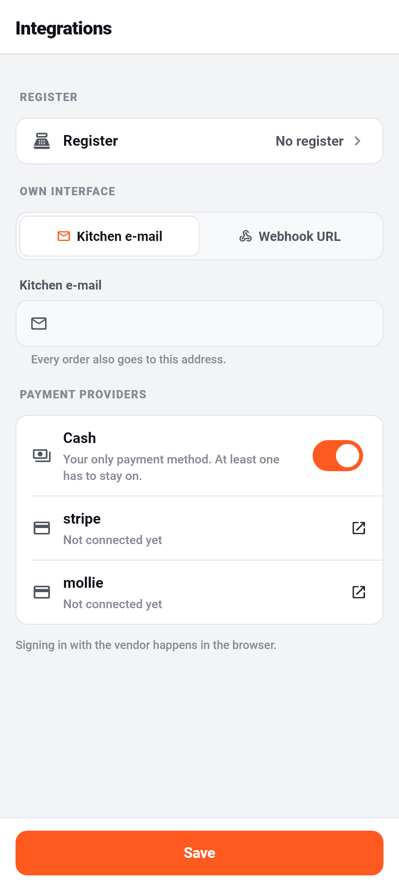
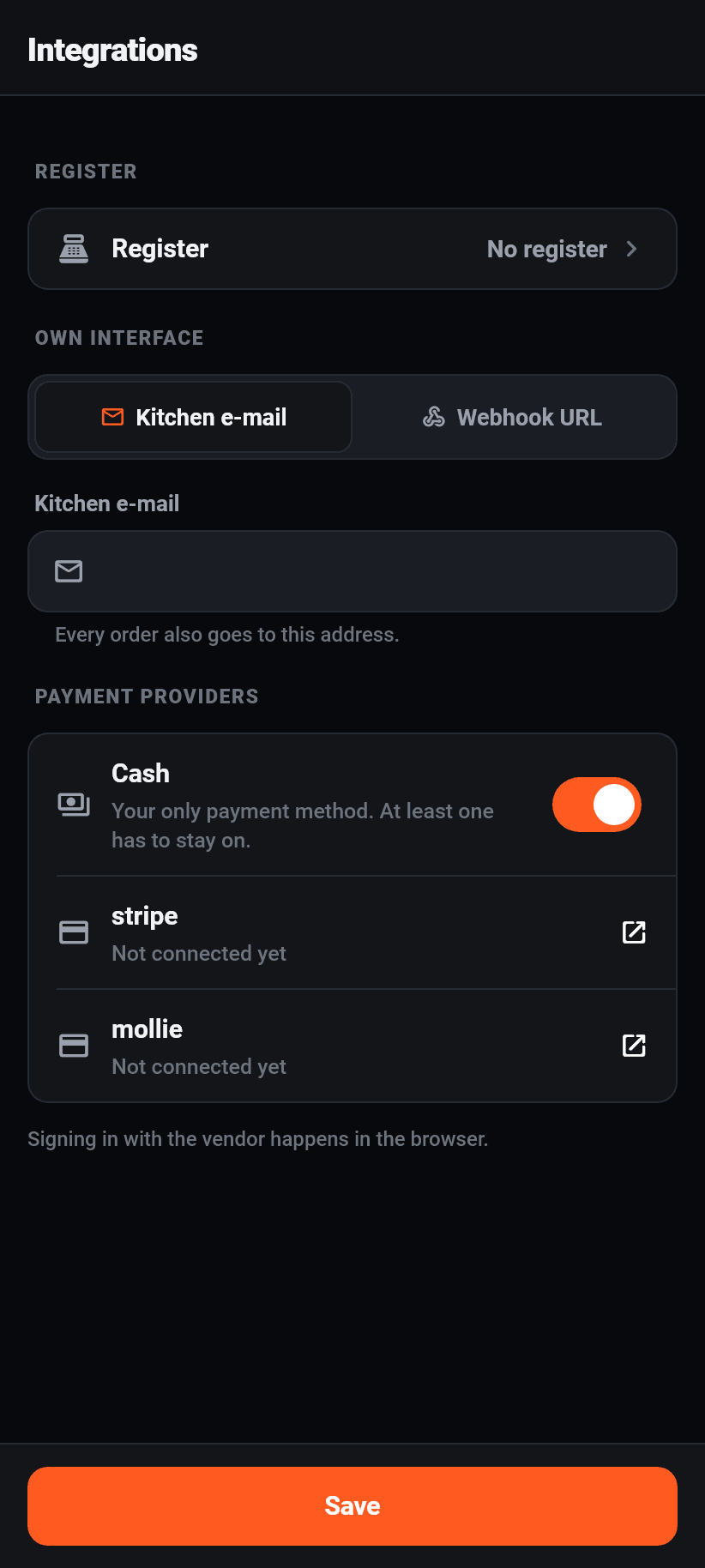
Three things on one screen: how guests pay online, which e-mail address new orders also go to, and which apps are connected to your restaurant.
With the payment providers, a switch per provider decides whether guests are offered it at checkout. Connecting runs in the browser, disconnecting works here. At least one payment method has to stay, and the app says so if you try to switch off the last one.
Orders by e-mail is part of every plan: every new order also goes to an address, for example the kitchen's. Orders paid online only go out once the payment is confirmed.
Under “Connected apps” are the apps that work with your restaurant, and each one can be disconnected here. It loses all access at once. An app is connected from inside the software in question, see the chapter “Integrations”.
Your stages
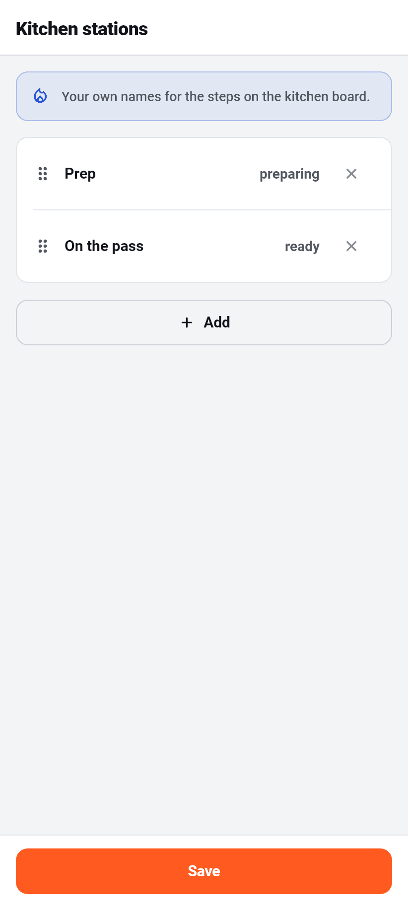
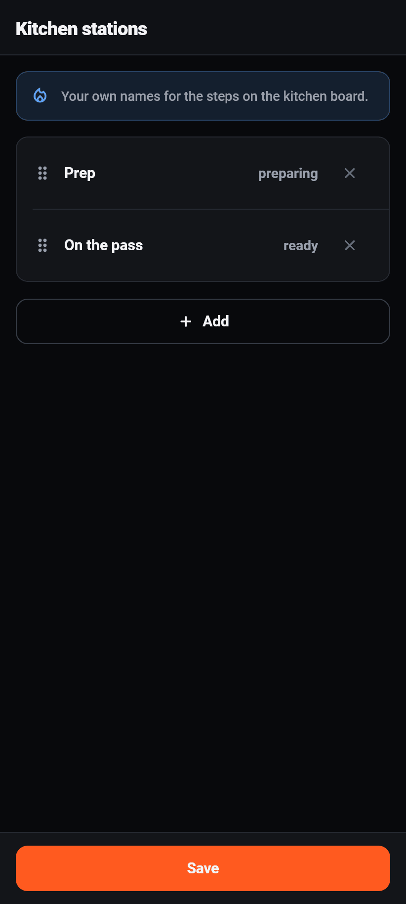
The steps an order goes through at your place. Out of the box there are four; you decide how many there are and what they are called, “at the pass” or “prep” for instance. Up to eight, at least two.
It is the SAME list as in the browser under Settings → Ordering, and the same one that becomes the columns on the kitchen display. One editor, not three: what you type here shows up everywhere.
Under each step is its meaning, and that answers the question you actually have when renaming: what does the guest learn. “Accepted” and “Ready” send them a message, “Being prepared” does not. Two steps may share a meaning: “on the grill” and “in the oven” are both “being prepared”, so your kitchen subdivides more finely without a guest having to learn five words they do not know.
The first step is the arrival. Its name is yours, its meaning is fixed: that is where every order comes in.
Tables and QR
The eleventh section, and in the dashboard it is somewhere else: there, tables have their own entry next to the orders. On a phone the four things needed during a service belong in the bar at the bottom, and a QR code is none of them. It is set up once and printed, and that is the description of a setting.
Creating them happens in one go: label, count and starting number, which produces “Terrace 1” to “Terrace 12”. Renaming and deleting work per table. ⚠️ When deleting, the app says what breaks: the printed code on that table stops working.
A tap on a table shows its QR code. It is drawn on the phone rather than fetched as a picture, so it works with no connection, and that is exactly the moment somebody has to show a guest the code because the printed card has gone missing. The link to it can be copied.
The print-ready sheets are opened by the printer button at the top, in the browser.
Table 4
Scan
no app, no account
Order
The restaurant's menu
Kitchen
with “Table 4”
The table is in the code. The guest types no number, and the kitchen guesses none.
Billing
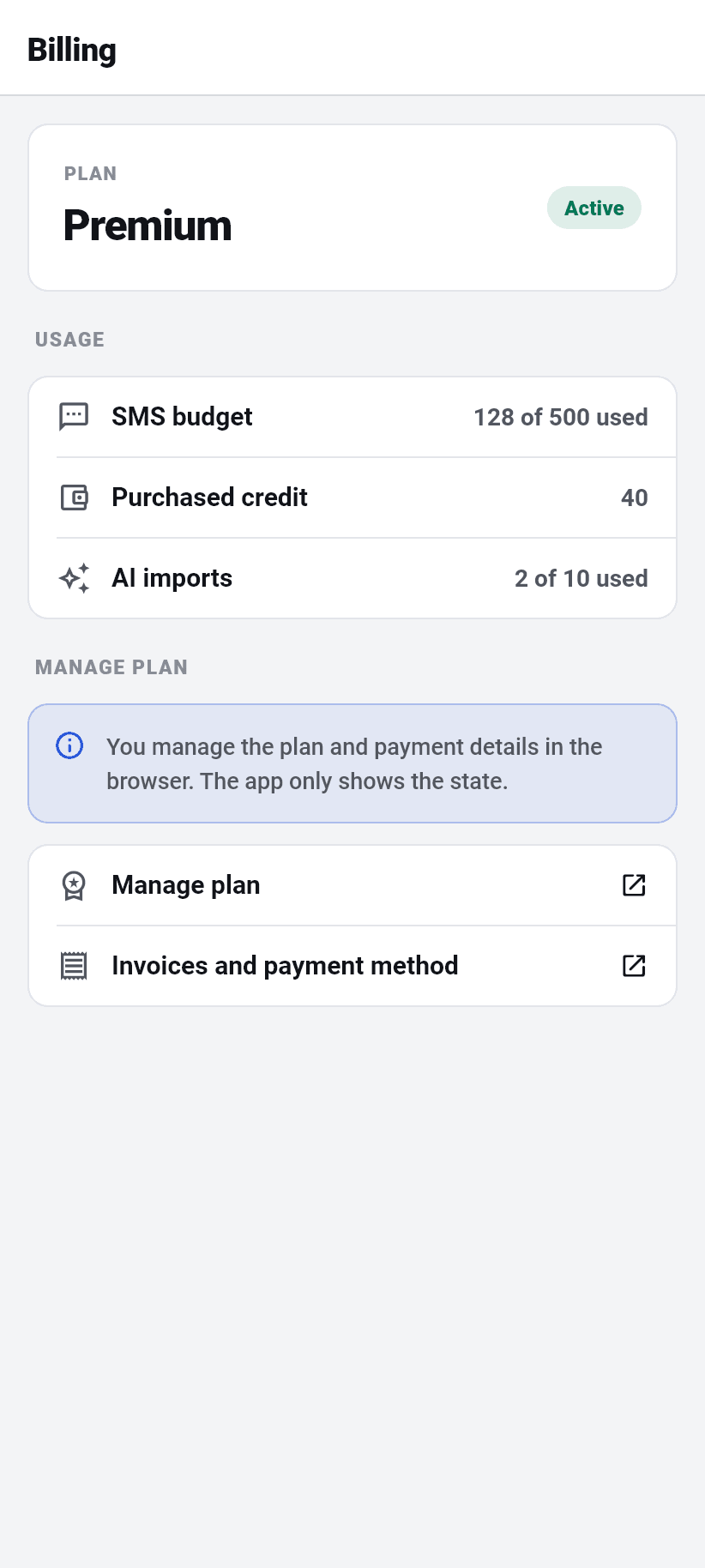
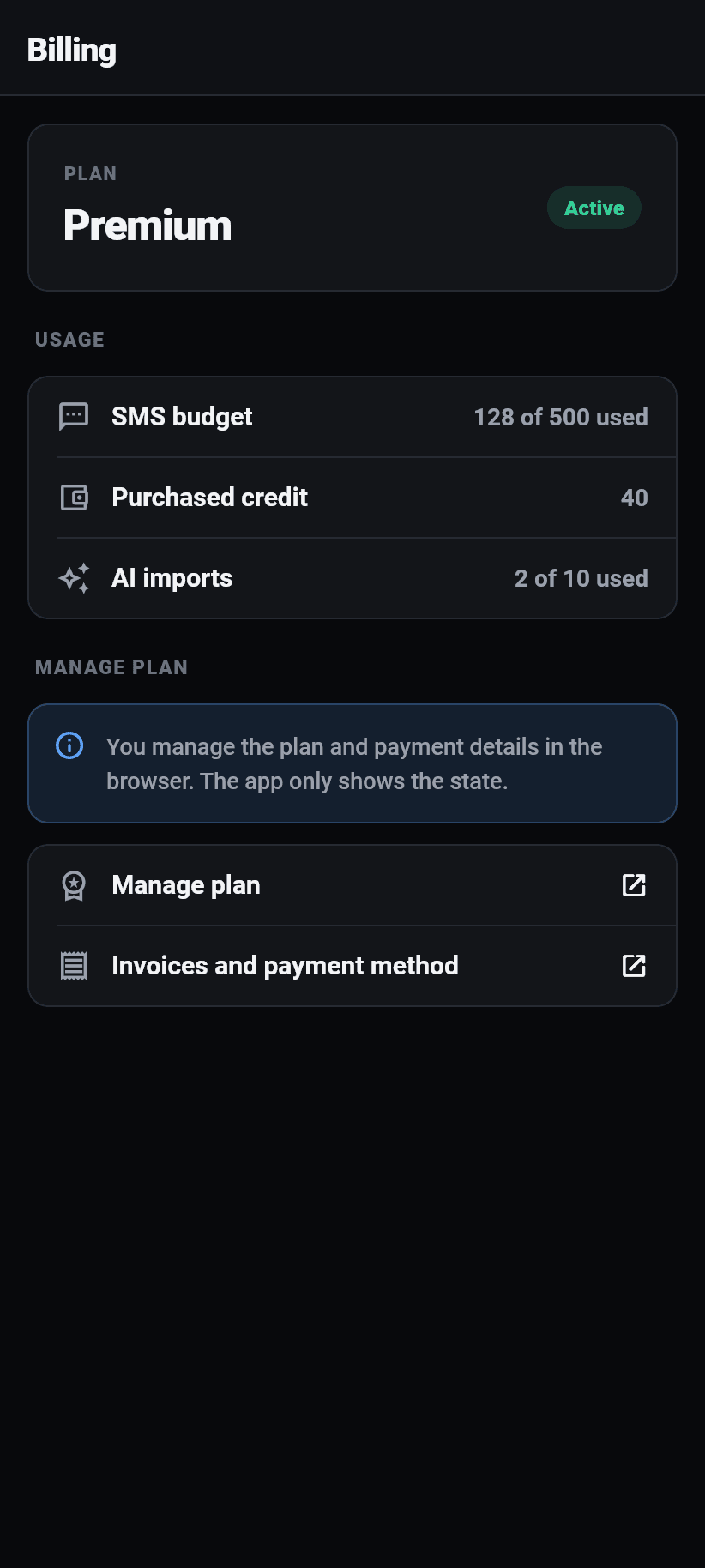
Under More, section Account, and only for owners. There you find your plan, the state of the subscription, the end of the trial or the next renewal date, and the usage: SMS sent against your budget, bought credit, AI imports used against the allowance.
The screen shows and does not change. Every purchase and every plan change opens the browser. Both app stores treat a subscription sold inside an app as a purchase of their own and want 15 to 30 percent of it; a restaurant's subscription is the wrong thing for that.
A manager does not see the row at all: they run the restaurant, and what it costs is not their screen.
Still unclear? Ask the assistant at the bottom right or write to us