ManualThe app for the restaurant
The app for the restaurant
The console on the phone: overview, orders, kitchen, menu, deliveries, reservations and team. It does almost everything the dashboard does.
What it does
The restaurant app is not a stripped-down dashboard with three buttons. It is the same work on a smaller device, and the list of what it cannot do is short enough to write out in full at the end of this chapter.
You sign in with the same account as in the dashboard. Anybody who learned the browser version finds the same names in the same order here: that is a decision, not a coincidence. Where the split differs, the app follows the web and not the other way round.
- Overview with figures for four ranges, revenue over time, bestsellers, busy hours and visitor numbers.
- Accept, advance, complete and cancel orders, with the phone call and the route straight from the order.
- The kitchen board with your own stations.
- Keeping the menu up to date: categories, dishes, pictures, allergens, option groups and the AI import.
- Deliveries for whoever drives, and reservations for the evening.
- Creating tables and QR codes, renaming them and showing the code.
- All eleven sections of the settings, delivery area on the map included.
- Inviting the team and setting rights per person.
- Your own account: password, second factor, sessions, language, appearance.
The bar along the bottom
There are at most five tabs down there, and the last one is always “More”. The other four are handed out in a fixed order, and only for areas you are allowed into: Overview, Orders, Kitchen, Menu, Deliveries, Reservations.
So somebody allowed everywhere gets Overview, Orders, Kitchen, Menu and More along the bottom. Deliveries and reservations then sit under More in the “In the restaurant” section, exactly there and not additionally somewhere else. A driver allowed only deliveries has them as the first tab.
Four plus More is the ceiling and it is not negotiable upwards. A bar with seven icons is a bar nobody hits with a thumb, and that is why “More” exists in the first place.
A number rides on the Orders tab as long as something is open. It is the shortest answer to “do I need to look right now”, and the reason the order is fixed rather than configurable.
The tabs keep their state. Scroll a long list halfway, look into the kitchen, come back, and you are where you were.
Overview
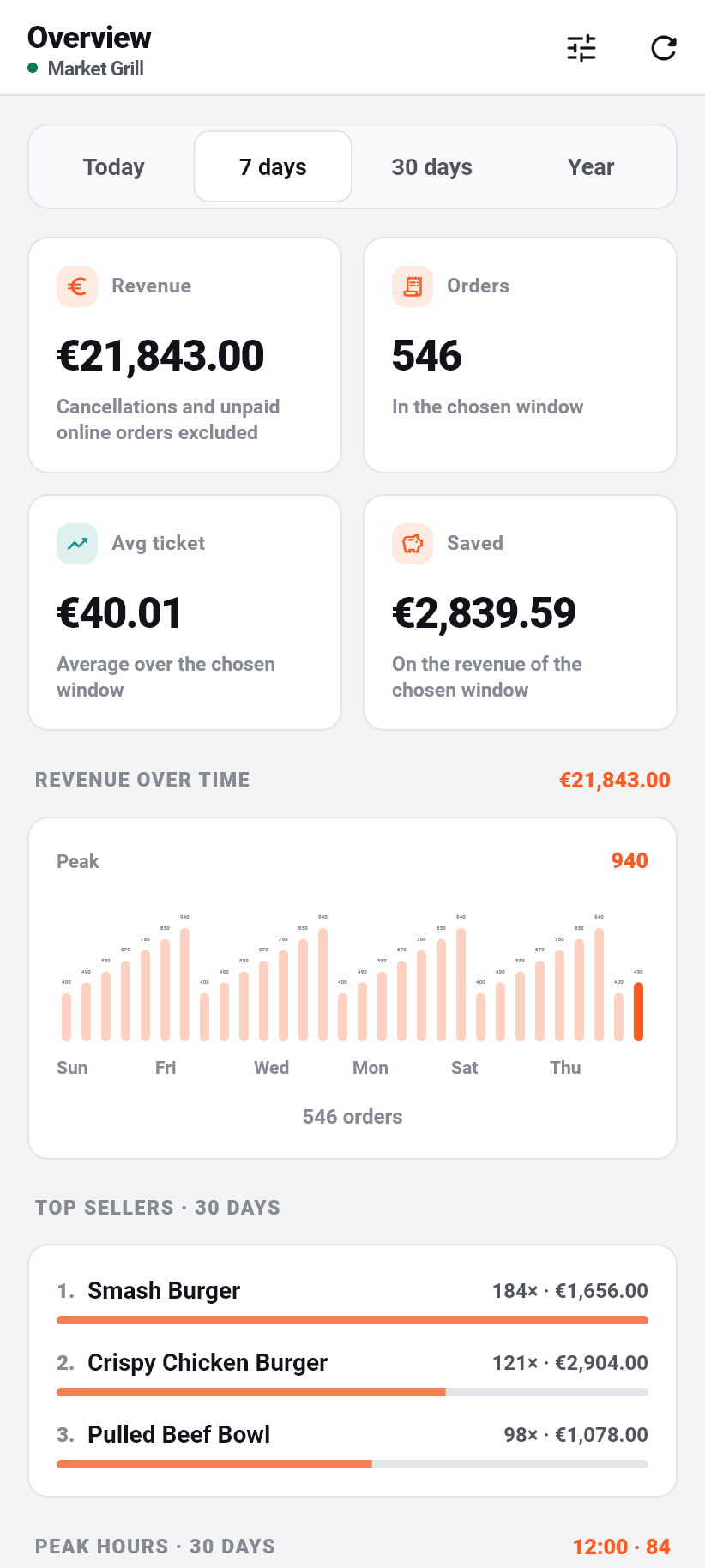
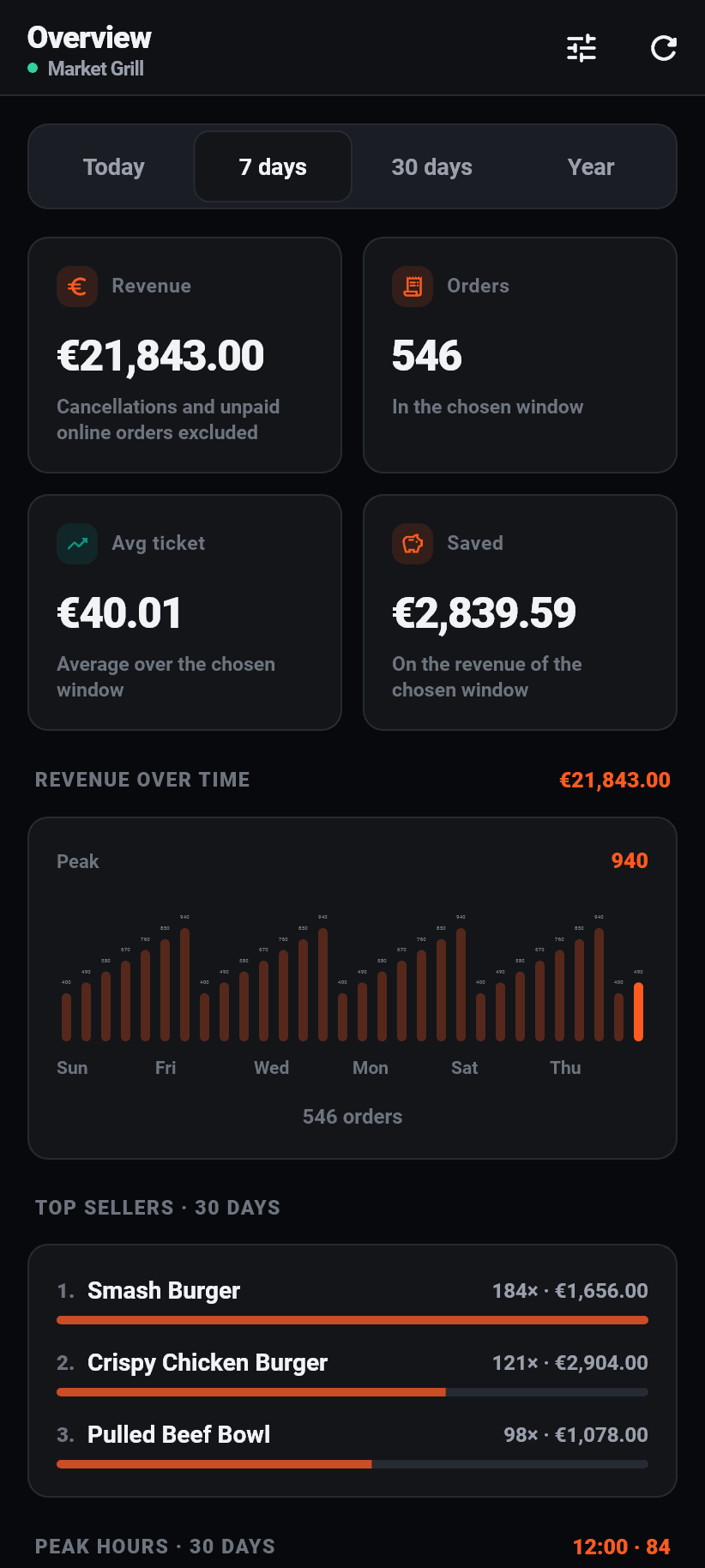
Four ranges at the top: today, 7 days, 30 days, year. The choice is remembered, and it is the same setting the dashboard in the browser uses.
Below them four numbers for the chosen range: revenue (without cancellations and without unpaid online orders), number of orders, average order, and “saved”, meaning what a delivery platform would have taken in commission on that same revenue. Under each number, in small type, what it refers to, so that nobody takes it for something else.
Then the revenue over time as bars, the bestsellers of the last 30 days with count and revenue, the busy hours by time of day, and the visitor numbers for your ordering page along with where guests drop out. A button at the top right refreshes all of it without restarting the app.
Two things sit ABOVE the board and cannot be switched off: the setup list, as long as something is open, and the notice about a paused subscription. Both are answers to “something is wrong here”, both disappear by themselves once it is not, and a thing you can switch off is switched off on the day it matters.
Arranging the overview
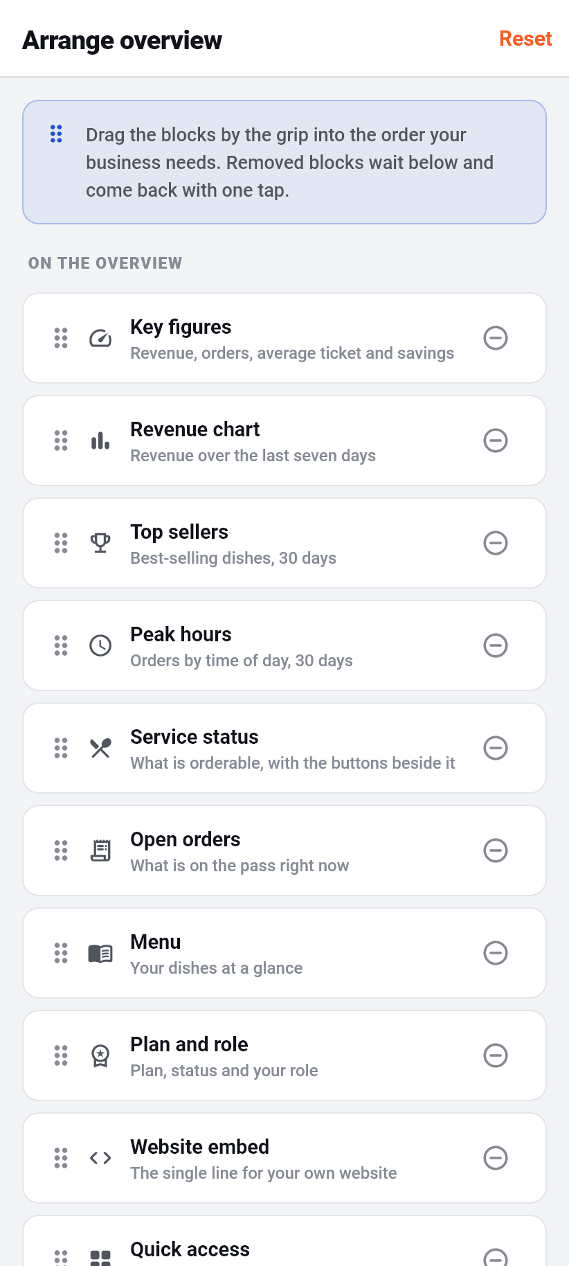
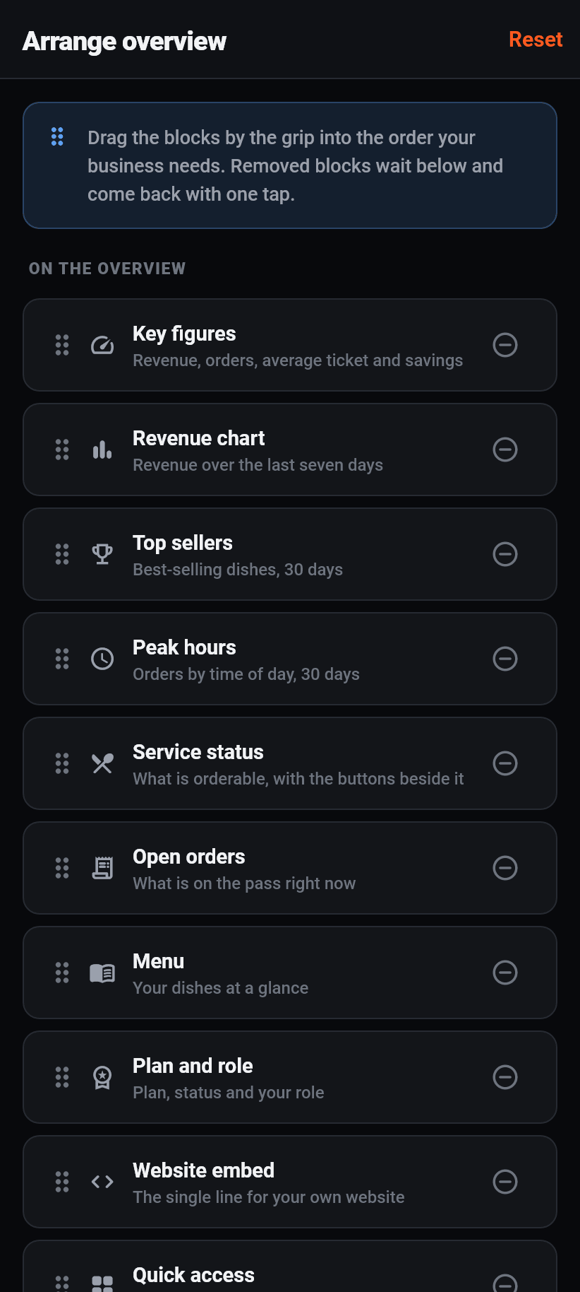
Which blocks appear in which order is up to you. The second button at the top right opens “Arrange overview”: dragging reorders, the minus takes a block out, and the ones taken out wait at the bottom and come back with one tap.
There is no save button, because an arrangement is not a form. Every change applies at once and survives a restart. “Reset” at the top restores the factory order.
The arrangement is YOURS, not the restaurant's. A place that lives off delivery wants the open orders at the top; one with walk-in trade wants the bestsellers. Neither of them is wrong, which is why neither of us decides it.
- Figures: revenue, orders, average order and savings.
- Revenue chart: the curve over the chosen range.
- Bestsellers: the best-selling dishes of the last 30 days.
- Busy hours: orders by time of day, 30 days.
- Visitors: views of your ordering page and where guests drop out.
- Service status: how many dishes are orderable right now, with the switches beside them.
- Open orders: what is in the kitchen at the moment.
- Menu: your dishes at a glance.
- Plan and role: which plan is running, how much of the trial is left, which role you have.
- Website embed: the one line for your own website, with the link to the guide.
- Quick links: straight into every area.
Orders
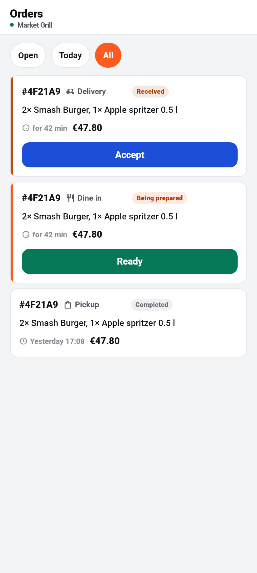
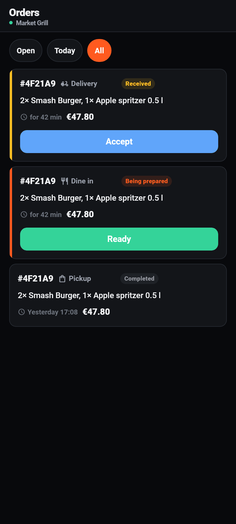
Three filters at the top: open, today, all. There is deliberately no search. During a service the question is never “find order 4812”, it is “what is still open”, and a search field nobody uses takes the space the filters need.
Every order is a card with the order code, the channel, the status, the items, the waiting time and the total. While it is open the card counts the elapsed time; once it is done the clock time is there instead, because “4 minutes ago” on an order from Tuesday tells nobody anything.
There is exactly one button on the card, and it is the next step: “Accept” on a new one, “Prepare” on an accepted one, “Ready” on one being prepared, “Complete” on a ready one. Completed ones have none.
One button instead of a status list, because an order can only go one way. A row of four buttons, three of which are wrong, is how an order ends up marked ready before it is cooked.
One order in detail
A tap on the card opens a sheet from the bottom. At the top the status and the channel as badges, below them every item with its quantity, the chosen options and the line total, and under that the total.
If the guest wrote something, it is in its own coloured box headed “Note for the kitchen”. It is the one sentence whose being missed makes the order wrong, which is why it is not the fourth line of small print.
Below that the guest: name, phone number, delivery address and, if a time was chosen, that time. A tap on the number calls. A tap on the address opens it in the phone's maps app.
At the very bottom is “Cancel”, in red and with a confirmation. The guest is notified about it and it cannot be undone. That is why it is the one button on this sheet that is not on the card itself.
Kitchen
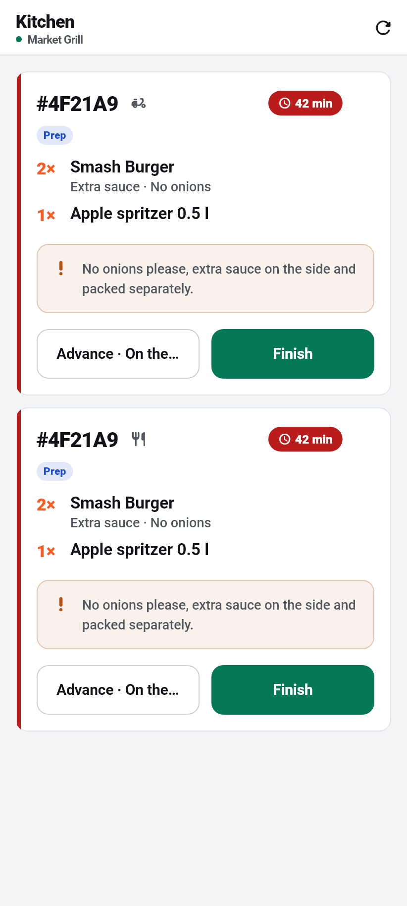
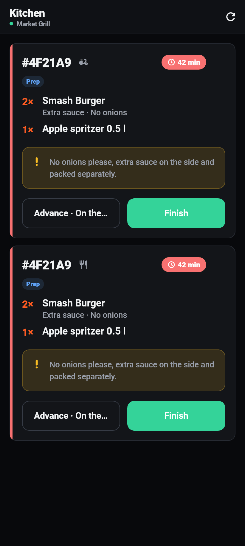
The kitchen screen as it fits on a phone: one ticket per open order, with the order code, the channel, the time since it arrived and the current phase. Everything here is bigger than in the rest of the app, because this device is not held: it leans against a wall in a hot room and is read from a metre away.
The oldest ticket is at the top. A board sorted newest-first buries the order that has been waiting twenty minutes under the one from ten seconds ago.
On the ticket the quantities are large, the chosen options small underneath, and the guest's note is again in its own box.
Two buttons, no more: “Next” moves the ticket into the next phase and names it, “Finish” takes it off the board. What the phases are called you set under Settings, Kitchen stations; each phase of your own belongs to one of the states the guest gets to see.
The time on every ticket keeps running without anything being reloaded, and the board keeps its last state when the network drops, with a line above it.
Menu
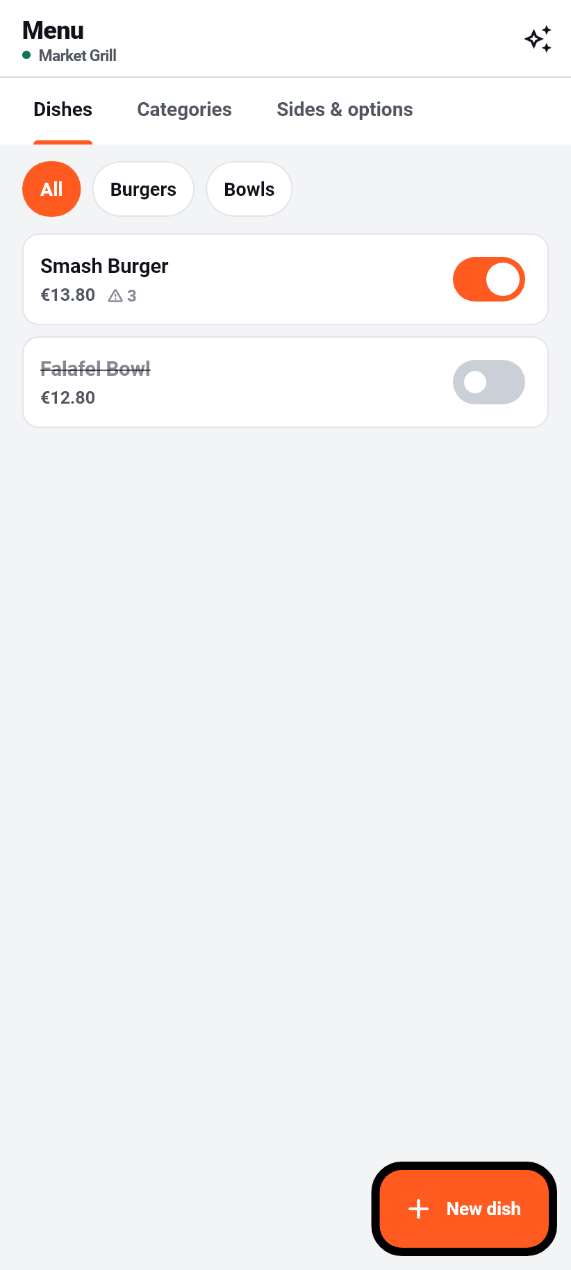
Three tabs: dishes, categories, sides & options. Three tabs rather than three screens, because keeping a menu up to date means moving between them constantly: a new dish needs a category, an empty category is worth nothing, and a size group is written once and attached to nine pizzas.
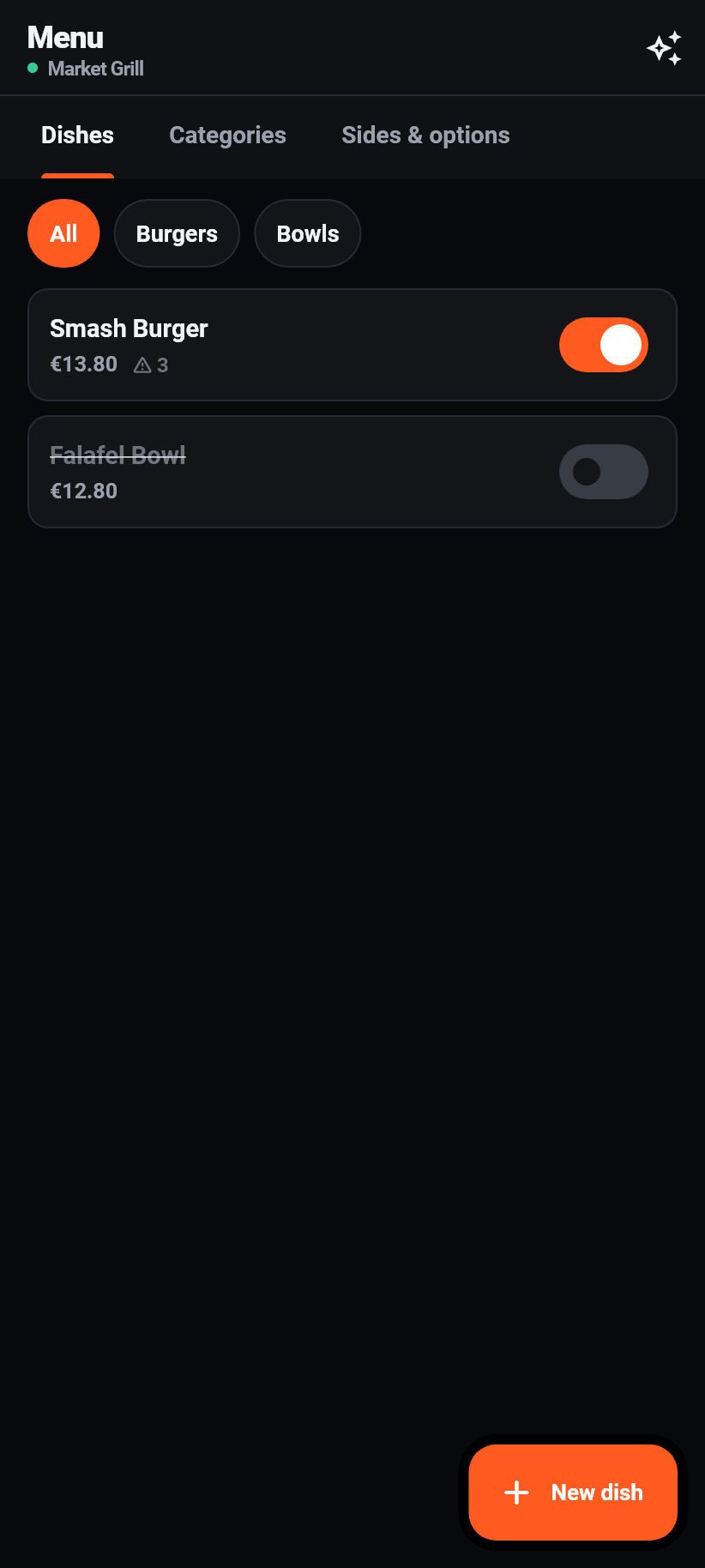
On the dishes, chips filter by category, and every dish has a switch that marks it sold out at once. A dish switched off is struck through here and gone from the ordering page in the same second.
Beside the price there is a small warning triangle with a number: that many allergens are on file. Tapping it opens the dish.
At the top right, behind the sparkle icon, is the AI import. It has a section of its own further down.
Editing a dish
The longest form in the app, and deliberately so: this is where what a guest reads before eating comes from. Name, price, description, category, a picture, the allergens, the diet marks and the option groups.
The fourteen allergens are the ones the EU names, in the order of the regulation, and they are the same fourteen as in the browser editor and on the ordering page. That is not tidiness: the declaration is a duty of the restaurant, and two surfaces with different lists would be two different duties.
Beside them is a field for your own entries, additives for instance, or “peanut oil”, comma-separated. What goes there is printed verbatim rather than pressed into a badge.
Diet marks such as vegetarian, vegan, gluten-free, lactose-free, halal and kosher are in a list of their own, separate from the allergens. An allergen is a warning a guest must heed; a diet mark is a promise the kitchen makes. Neither may ever end up in the other's column.
A picture can be added or replaced, up to 3 MB. Whether pictures are shown on the ordering page at all you decide under Design.
Sides and options
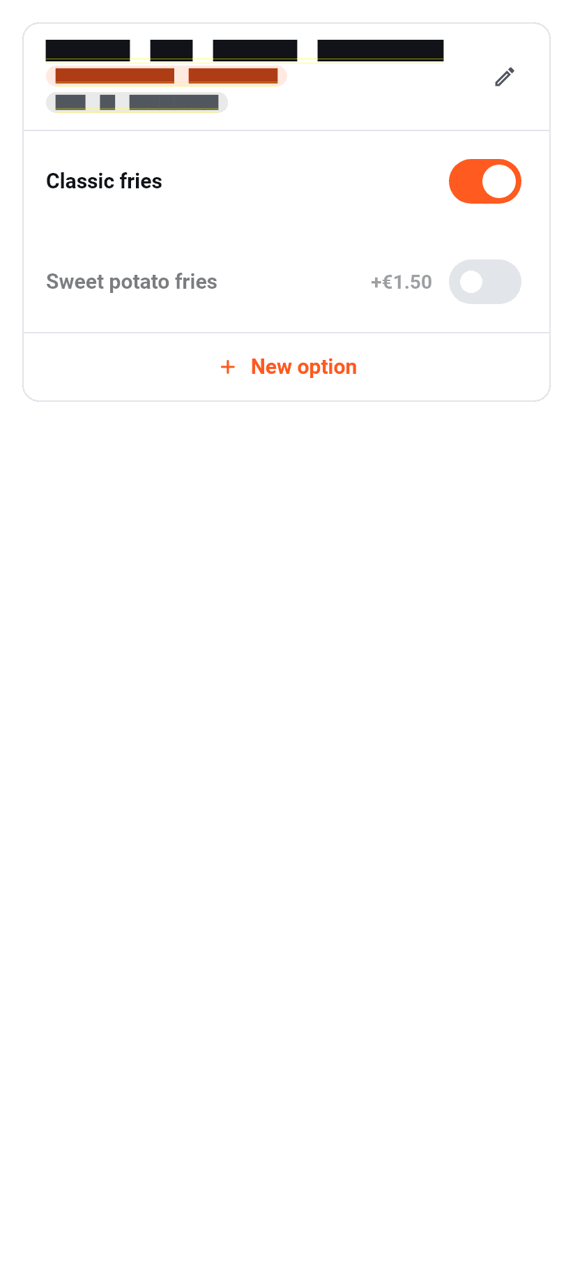
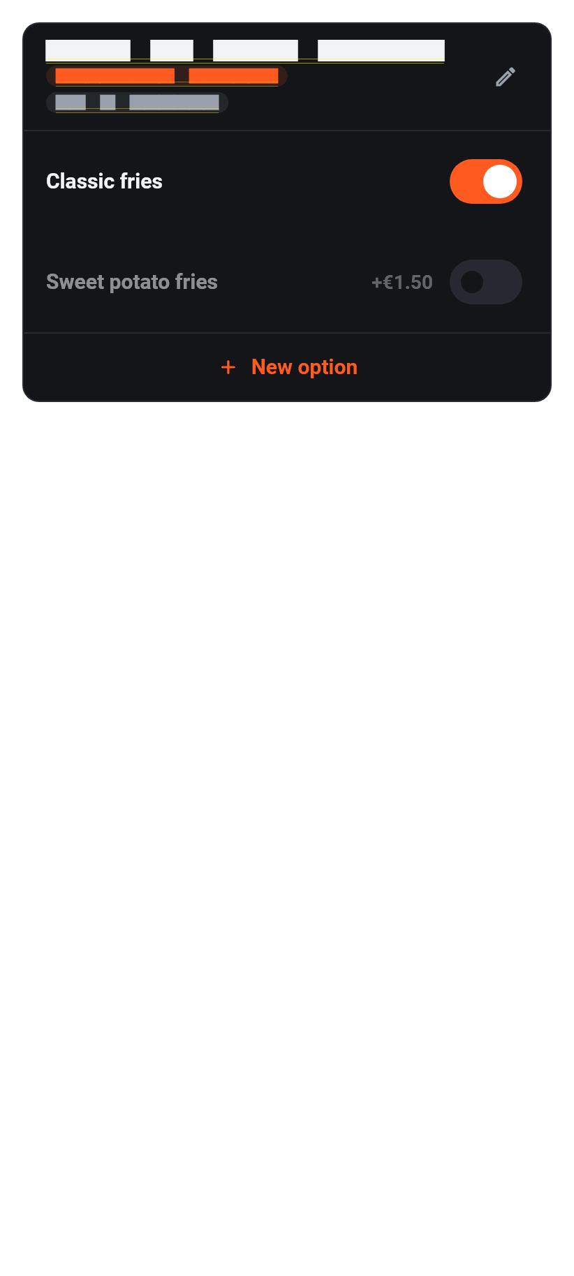
The third tab of the menu separates two kinds of group. The library holds the ones that belong to several dishes: “size”, “side of your choice”, “extras”. Beside them are the ones that belong to a single dish only.
Per group you set how many options may be chosen at least and at most. At least one makes it a required choice; the guest then does not get past the sheet.
Every option has a name and a surcharge, which may be zero. A library group says how many dishes it sits on, and when deleting it the app says it disappears from all of them.
Reading the menu in
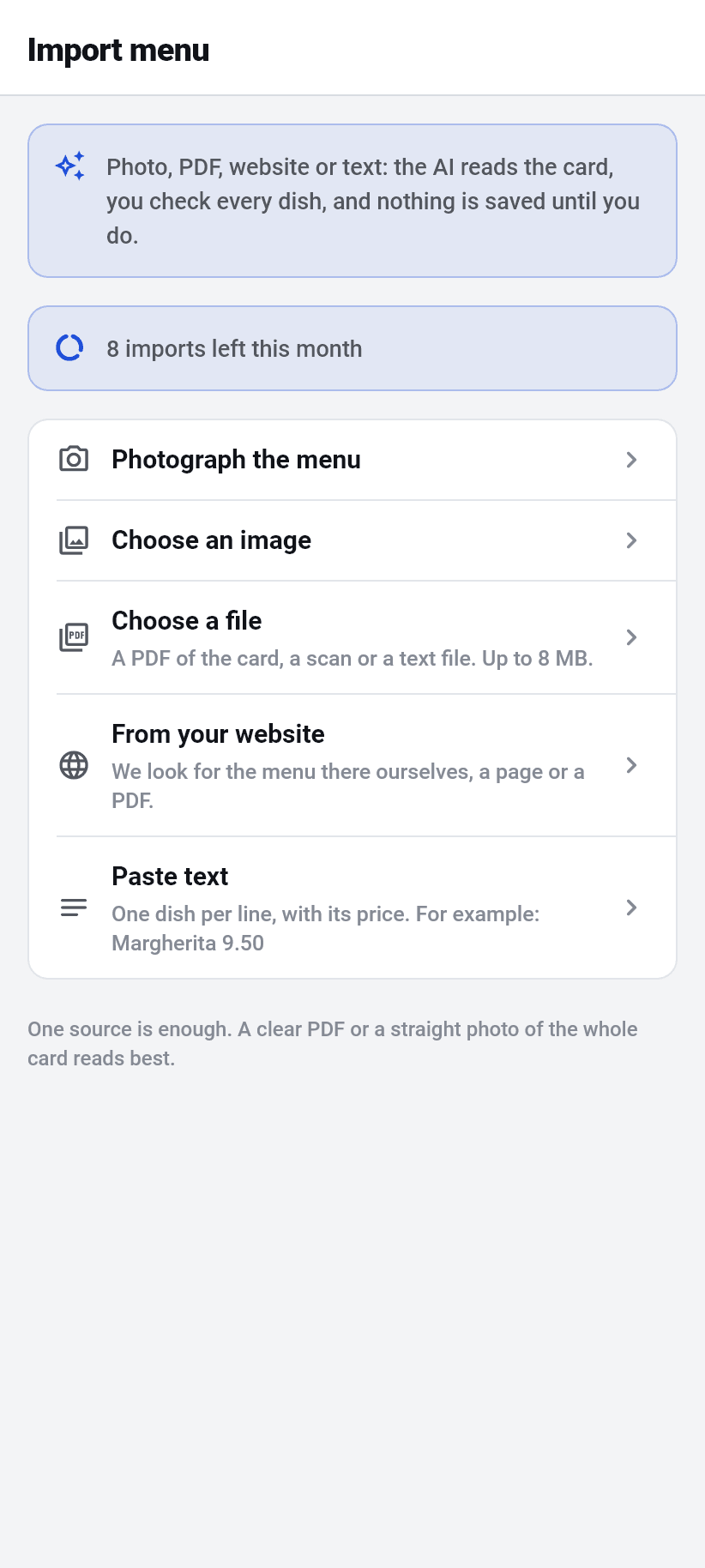
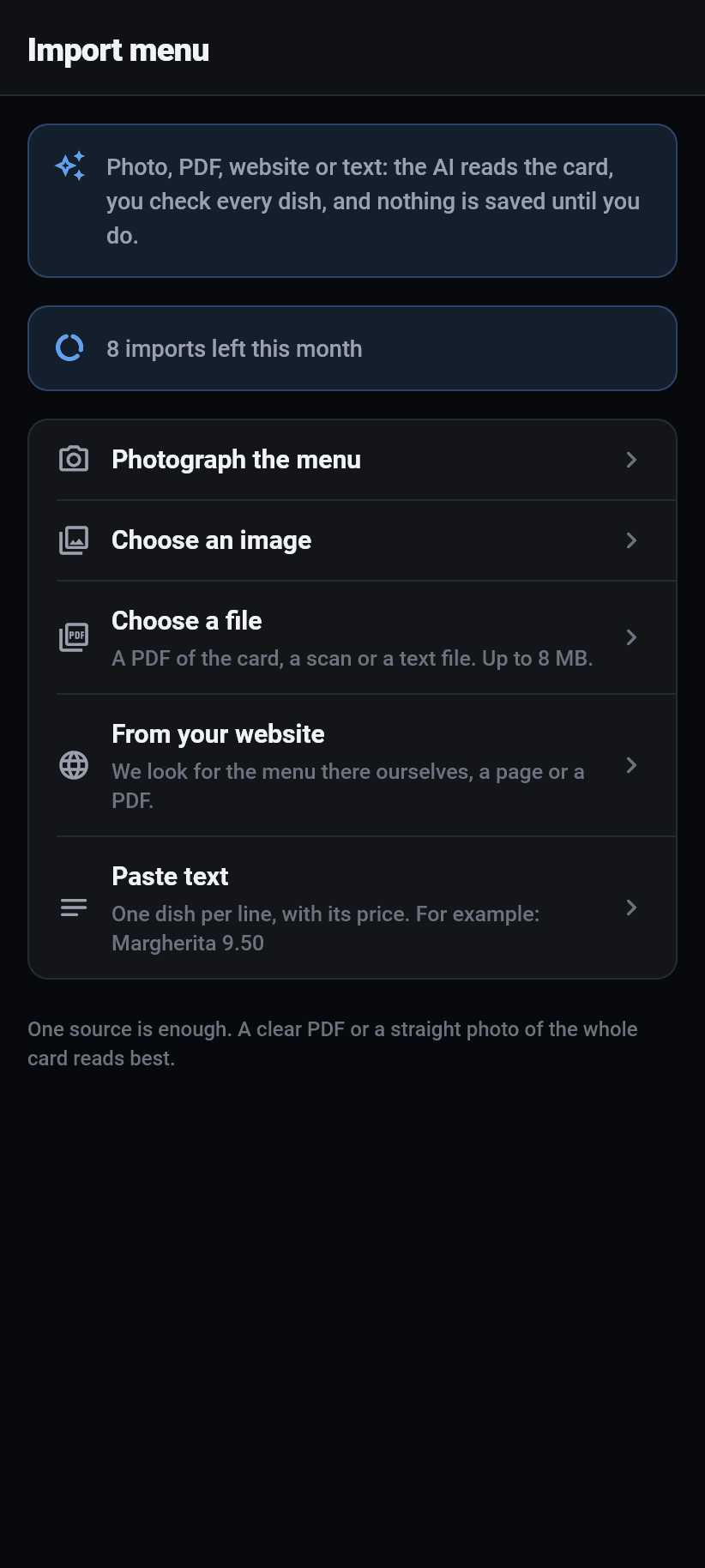
The AI import takes five routes: photograph the menu, pick a picture from the gallery, take a file (PDF, scan or text file up to 8 MB), give your website, or paste text with one dish per line. One source is enough, and how many imports the month has left is written above.
There are three steps, and the third is the real one. First you pick the source, then the AI reads it, which on a large menu takes up to a minute, and then comes the review. Nothing is saved until then.
In the review every dish appears with its price and its allergens. If the menu has a legend, it is shown: codes belonging to one of the fourteen EU allergens are taken as an allergen, the rest as additives. Codes with no entry in the legend get a suggestion you have to look at, and you can either assign them or hide them.
An allergen can be added to and removed from any dish. A diet mark such as “vegan” can be TAKEN OFF but not added: the dangerous direction is the one that claims more than the printed menu did.
If the same question appears on several dishes, the app suggests merging them into one group, shows beforehand how many dishes are affected, and lets you switch it off or rename it per group.
⚠️ At the end there is a checkbox you have to tick yourself: that you have checked dishes, prices and allergens and that as the operator you alone are responsible for their correctness. Only then is anything written. If you want, the existing menu can be deleted first; that is a separate question, because it takes categories and shared option groups with it.
Deliveries
A screen of its own, and explicitly not the order list with a filter on it. The order list answers the owner's “what is going on today” and shows items, fees, payment method and status buttons for that. Whoever drives is standing in front of the car with the phone in hand and has three questions: where to, how much to collect, is it paid already.
So the address is at the top and large, the amount beside it, and there are two buttons: route and call. Along with “On my way” and “Delivered”.
At the top the open runs with their count, below them the ones delivered most recently. Pull down to refresh.
A driver only ever gets delivery rows to see, and not because there is a filter here, but because the database gives them nothing else. The filter is for the other roles. A filter is a request, a rule in the database is a boundary.
Reservations
One day per view, not a continuous list. In a restaurant exactly one question applies: who is coming today? A list across three weeks answers it only after scrolling, and on a Friday evening nobody scrolls.
The days are boxes above, each with its count beside it, so you can see the full Saturday without opening it. Above the list is how many bookings and how many guests the chosen day has.
Every booking has a time, a name, a party size, a phone number, a note, its tables and its state. Below it is the button that fits right now (Confirm and Decline, Arrived or Left), everything else in the “More” menu, and only what is possible right now; anything destructive asks first. You pick several tables, with the same seat feedback as in the dashboard. The guest gets the same mails as there.
At the bottom right is “By phone”. With it you enter a booking that came in on the handset; it counts towards occupancy exactly like a booking from the website.
If reservations are switched off, that is a notice at the top: guests cannot book anything, but you can still enter one by hand. The settings for it (duration, grid, lead time, largest party) are done in the browser.
Team
Who has access to this restaurant is here, with their role and their areas. Inviting works right away: enter the e-mail address, pick the role, invite. The person gets a mail with a link that is good for fourteen days; open invitations are listed below and can be copied or withdrawn.
The role is a picker, the areas are checkboxes, and the checkboxes sit folded away. An owner thinks in roles (“Marco drives”) and only in exceptional cases in areas (“but in the evening he also works the bar”). If both stood side by side as equals, every person would mean ten decisions instead of one.
What a role brings with it is worked out by the server and sent along. That is why the app cannot claim a role can do something the API refuses it.
The owner cannot be changed, and your own row is marked “you”. Several people are part of the Pro plan upwards.
The More tab
The last tab, and the only one everybody sees. It is a gathering place rather than a screen, and it has three sections.
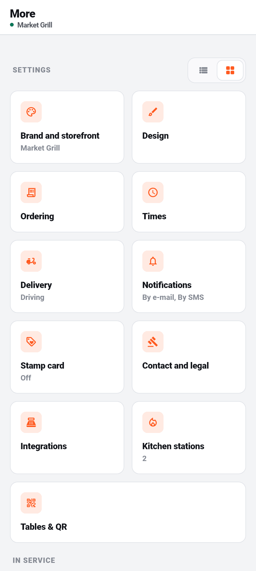
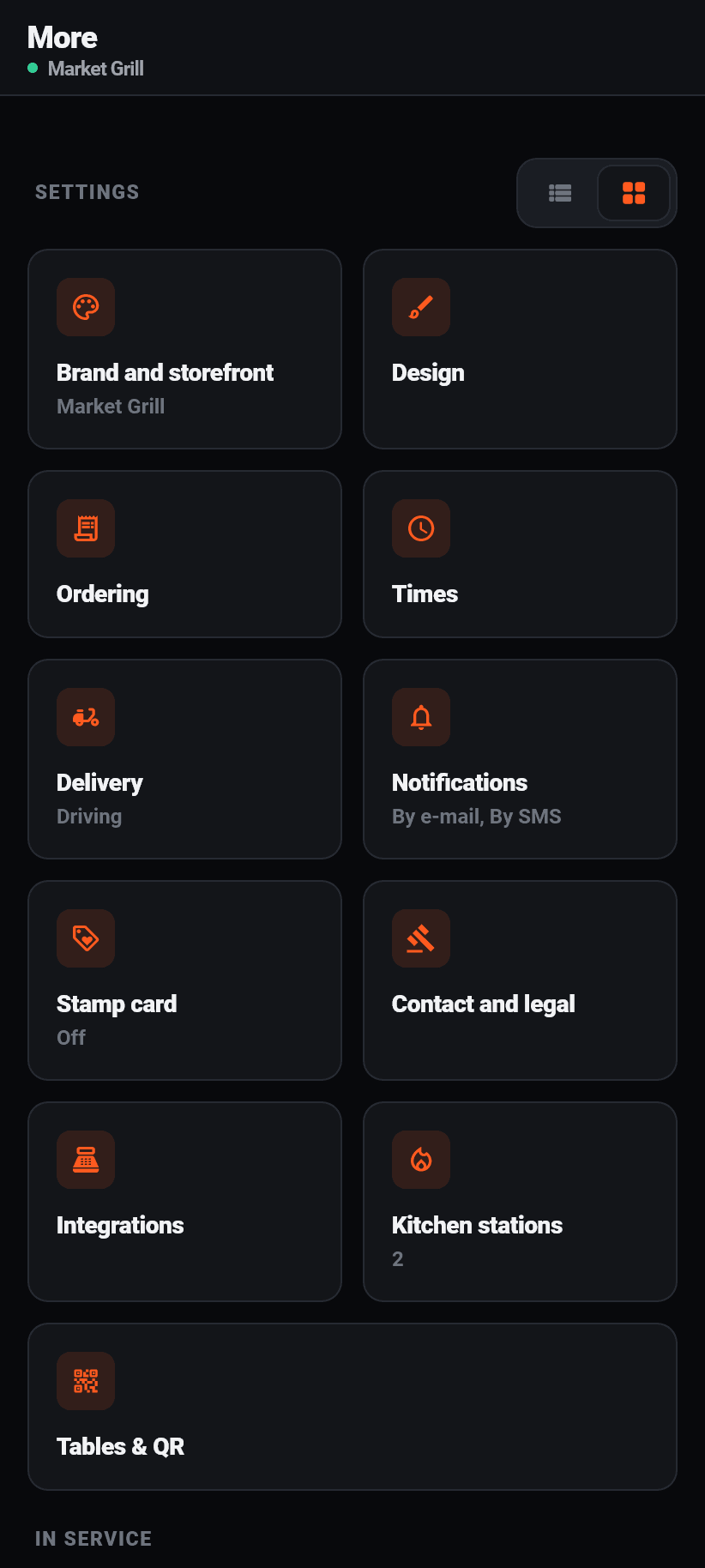
“Settings” appears as tiles or as a list, switchable at the top right, in the same place a file manager puts that choice. The list shows each setting's current value, so “Stamp card: off” or “Kitchen stations: 2”, and is therefore the faster route when you want to check rather than change. The tiles are faster to aim at. The answer is remembered.
The eleven sections are written out here rather than hidden behind a single “Settings” row. The dashboard in the browser shows its tabs all at once, and an app that answers “where are the delivery zones” with three taps and a guess is not the same product.
“In the restaurant”: deliveries, reservations and team, so the areas that did not make it into the four tabs below. What is already down there does not appear here a second time.
“Account”: your account, your notifications, billing with the current plan as a badge beside it, switch restaurant, the way back to the guest view, and signing out.
What stays in the browser
This list is complete, and it is pinned in the source code: a check fails as soon as a new sentence in the app points at the browser without being listed here, and equally as soon as one stays although the app can do the thing itself by now. That is not tidiness but the reaction to a real fault: the logo, the AI import, two-factor authentication, the dish pictures, the cover image and the delivery zone map were all on it once, and the sentences stayed behind after the app could long since do it.
Every one of these notes carries its own button, and it opens exactly that page. “It is in the web dashboard” without a link leaves the owner hunting flavoso.com for a tab, and that is the larger part of the work.
- Creating a restaurant. The account exists in the app, the restaurant is created on the web because much more is asked there.
- The setup wizard. Its last step can reset design, colours, ordering channels, times and delivery area to defaults, and a step back like that does not belong behind a row that gets hit by accident in an apron pocket.
- Plan, payment details and the automatic SMS top-up. Both stores want 15 to 30 percent of a subscription sold inside an app; the app shows the state honestly and links out to manage it.
- The print sheets for the QR table cards. Printing happens from a computer anyway.
- Signing in to a payment provider. The way back from that sign-in needs a cookie a native app cannot hold. Everything else about it, so offering and disconnecting, the app does itself.
- Importing a Google listing. It hangs off the wizard's restaurant search; the rating and the reviews it produces are shown by the app.
- The text building blocks for your privacy policy. Long paragraphs to read and copy, and a phone is the worse place for that.
- The preview of your ordering page, because that is where it runs. The view inside the app is unaffected by it.
- The reservation settings. The reservations themselves, so accepting, declining and assigning a table, the app can do.
- Receipt printers and your own webhooks. You set both up once, with addresses and secrets nobody types on a phone; the app takes you to the Integrations page with one button.
Still unclear? Ask the assistant at the bottom right or write to us